
 |
H |
i peeps! Although some of you are probably fed up seeing a similar post to this one around blog land...
|
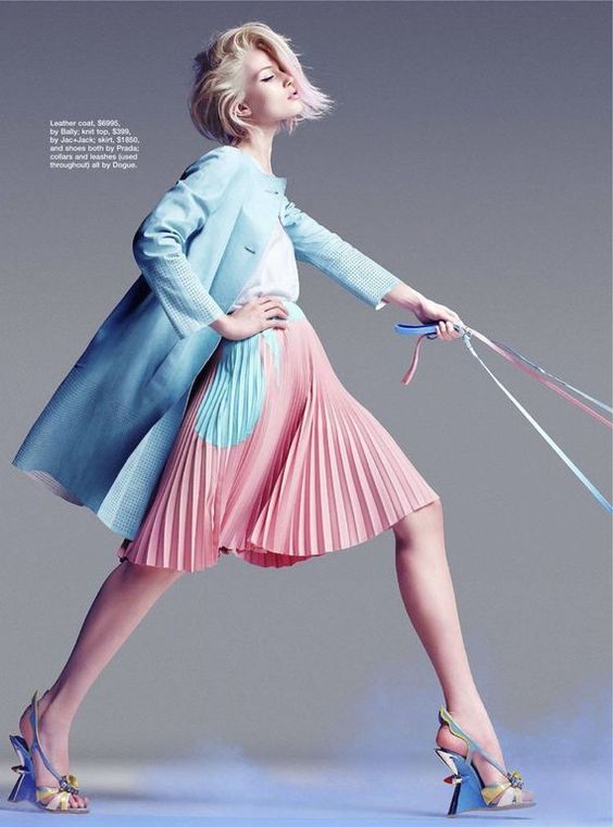
anyways, I just thought to share it, (just in case you are one of the few that haven`t). Today`s post, is about Pantone Color of the year 2016 (which they happen to reveal every month of December (- aw the excitement and the anticipation is unreal... believe me, I`m one of those who just can't wait!!!). According to Pantone, the color Rose Quartz is the top color for this year, along with Serenity.
|
||

|
Which is quite a big contrast from 2015 "Marsala" and it`s the first time ever, that two colours have been chosen. "Fashion is the main influence, regarding the colors that will be the next big trend." |
 source: http://pin.thenews17.net

|
"There was a time, where the feminine fashion dictated the home interiors, while the masculine fashion dictated the commercial. Although since the 80`s this is no longer the case, as we had started to see more fashionable men (on TV program's, movies and music videos), wearing softer colors. It was then, that we started to see, men, who like to follow fashion, not only could wear pink or lavender clothes, but they could also live in spaces decorated in pastel colors. To this day, this idea is still very strong" - say`s Mrs. Pressman (the president of Pantone color institute).
|

| Source: http://plaidstallions.blogspot.co.uk/ | (Groovvyyy or what?) | Source: http://vogueguy.tumblr.com/ |
Also, why the opposing powder pink and serenity blue? - You may ask. (Which translates, for you and me, Rose Quartz and Serenity). Nowadays, we seem to find comfort in using colors as a form of expression and thankfully, there`s less concern about being judge (finally!!!) for it. With the stresses and worries of our daily life`s... we seek mindfulness and well-being as an antidote to modern day stresses. These two chosen colors are meant to represent a sense of balance and peace, since we live in an insecure world and nowadays... there`s a need to feel more safe and relaxed than ever.
|
 Source: http://www.vogue.co.uk/miss-vogue |
The executive director for Pantone color institute, also explains that...

To check more info. as why Pantone chose these beautiful two colors, click here, to go to their website. And I`m leaving you, with photos of these beautiful interiors, to inspire you, just in case you fancy, adding any of these two restful and peaceful hues to your home. Me? I`m considering using a similar Rose Quartz paint, somewhere in my home. But I`m yet to finish decorating my dining room... watch this space.
|
 |


Source: http://www.vogue.com.au/

Source: https://www.bloglovin.com
|

Source: http://www.artnau.com/
|

Source: http://www.horchow.com/

Source: http://www.elledecoration.co.uk/
|

Source: http://www.housebeautiful.co.uk/
|

Source: http://living-room-a.com/
 |

Source: http://www.decorpad.com/
|

Source: http://www.elledecoration.se/

Source: http://www.housebeautiful.com/
|

Source: http://www.thejungalow.com/
|

Source: http://thed

Source: https://www.flickr.com
|

Source: http://www.popsugar.com/
|


Source: http://casavogue.globo.com/

Source: http://casavogue.globo.com/
|

Source: http://obeedesigns.tumblr.com/
|

Source: http://www.housebeautiful.com/
 |

Source: http://casavogue.globo.com/
|


Source: http://messagenote.com/
|
 |

Source: http://casavogue.globo.com/

Source: http://obeedesigns.tumblr.com/
|
 |

Source: http://casavogue.globo.com/
 |

Source: http://www.bhg.com/
|
 Source: http://h-a-l-e.com/ |
So, what do you think of these two colors... is it a yes or a no?
As predicted... we really should start to see these beautiful (in my opinion) colors... EVERYWHERE! What next? The loo?:) |

Source: http://media.photobucket.com/
No comments
Post a Comment